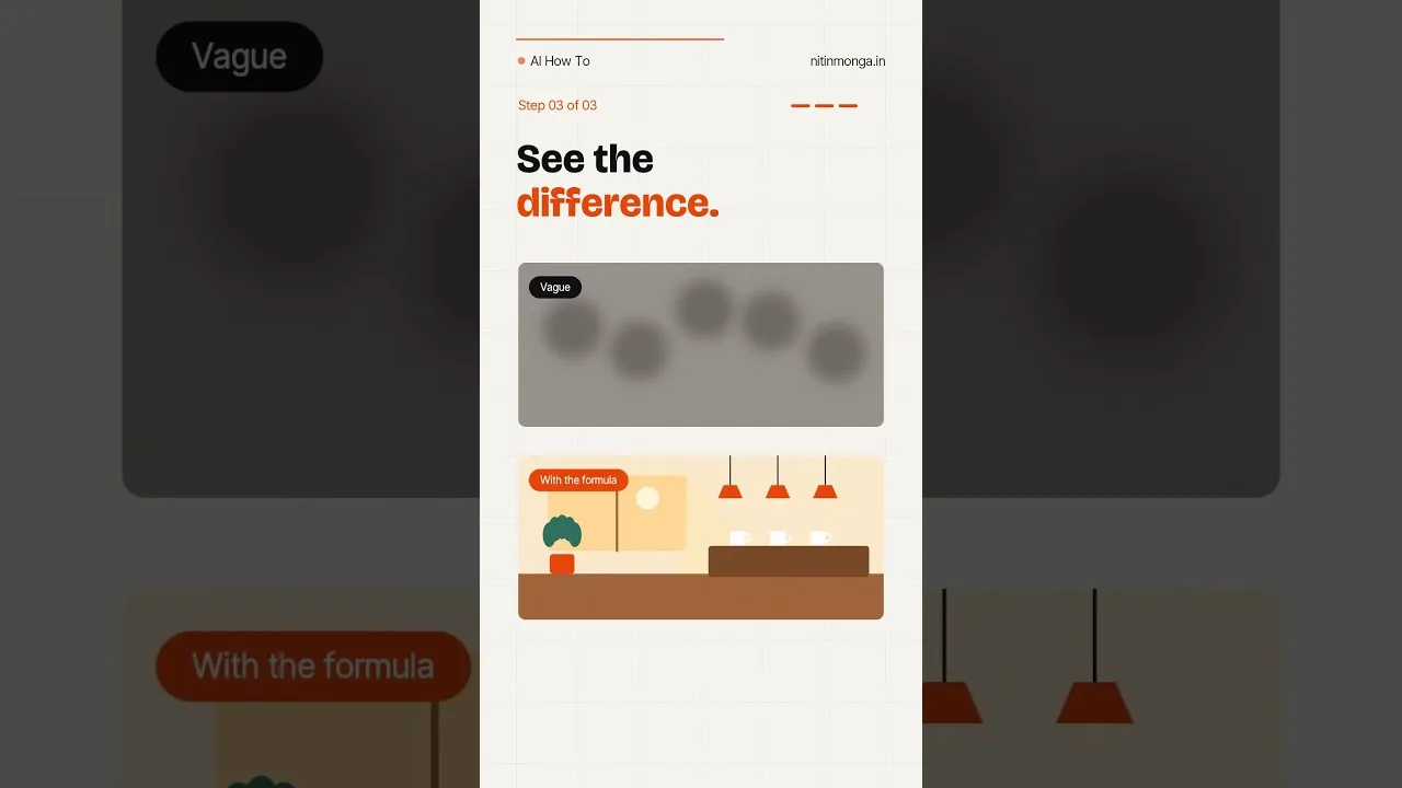
Style is the difference between the same subject rendered as a photograph, a watercolour, a sticker, or a blueprint. In the Whisk AI image studio, style is a first-class input — chosen by words or supplied as a reference image — and understanding how it works turns random pretty pictures into a consistent visual language you control.
This guide tours the major style families, explains what a style reference actually transfers, and gives a selection method for matching style to purpose: a profile portrait, a product listing, a presentation, and a child's birthday banner want four different answers.
By the end you will choose styles the way designers do: by audience and job, not by whichever thumbnail looked exciting first.
What Style Actually Controls
Style governs the rendering rules: how edges behave, how colour is laid down, how much detail is shown, what the light feels like. It does not change what the picture depicts; it changes the language the picture is depicted in.
That separation is Whisk's great convenience. Keep the subject constant, swap the style, and one idea becomes a photograph for the listing, an illustration for the blog, and an icon for the app — a set that matches because its content never changed.
Photographic Styles
Photographic styles aim at camera truth: natural light, lens depth, plausible texture. They subdivide by intent — candid snapshots, studio portraits, product photography, editorial scenes — and prompts or references that name the photographic situation get the most believable results.
Photo style is the right default for anything that must be trusted at a glance: listings, profiles, documentation-style images. Its failure mode is the uncanny almost-real face, which is why portrait work gets its own guide in this library.
Illustration and Painting Styles
Illustration styles trade realism for clarity and charm: watercolour softness, ink line work, flat colour, children's-book warmth. They forgive the model's weaknesses — a drawn hand need not be anatomically perfect — which makes them the most reliable family for character work.
Painting styles carry mood best. When the picture's job is atmosphere — a story cover, a poem's companion, a moodboard — a named painterly direction outperforms any photograph at the same prompt. The styles combine naturally with the method in the Whisk AI prompt writing guide, where style words are placed early for maximum steering.
Design Styles: Icons, Stickers, Posters
Design styles serve communication: flat vector icons, bold stickers, poster layouts, infographic elements. Their rules are simplicity and contrast, and they reward the plainest prompts in this entire guide — a subject, a palette, nothing else.
Generate sets, not singles, when working in design styles. A family of icons in one consistent treatment looks professional; one icon, however charming, is an orphan. Consistency across a set is where reference-driven style truly earns its keep.
Style References: What Transfers
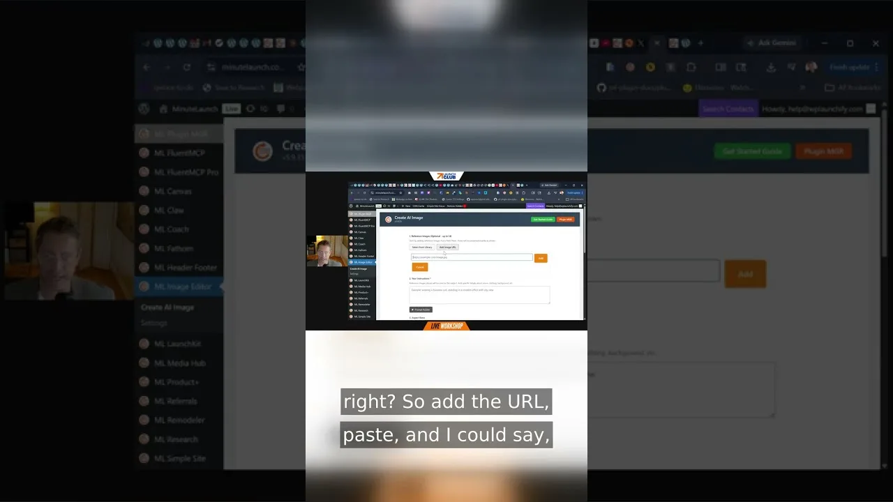
Supplying a style reference image transfers the treatment — palette, line, texture, light — while your subject comes from elsewhere. The reference's own subject should ideally be neutral, because strong content in a style image can leak into your result.
Test a new style reference on a boring subject first: an apple, a chair. Watching the treatment applied to something unexciting teaches you exactly what the reference contributes, before you spend it on a picture you care about. The mechanics sit inside the tool tour in the core image creation tools in Whisk AI explained, and the experiment takes two minutes.
Matching Style to Purpose
Ask what the picture must do. Persuade a buyer: photographic product style. Explain a process: flat design. Carry an emotion: painting. Be recognised at sixteen pixels: bold icon style. Purpose eliminates most of the catalogue, leaving a shortlist your taste can settle.
Audience refines further. Children's content forgives — and rewards — illustration; professional documents punish whimsy in the wrong places. The same subject can legitimately wear three styles for three audiences in one week.
Build a House Style
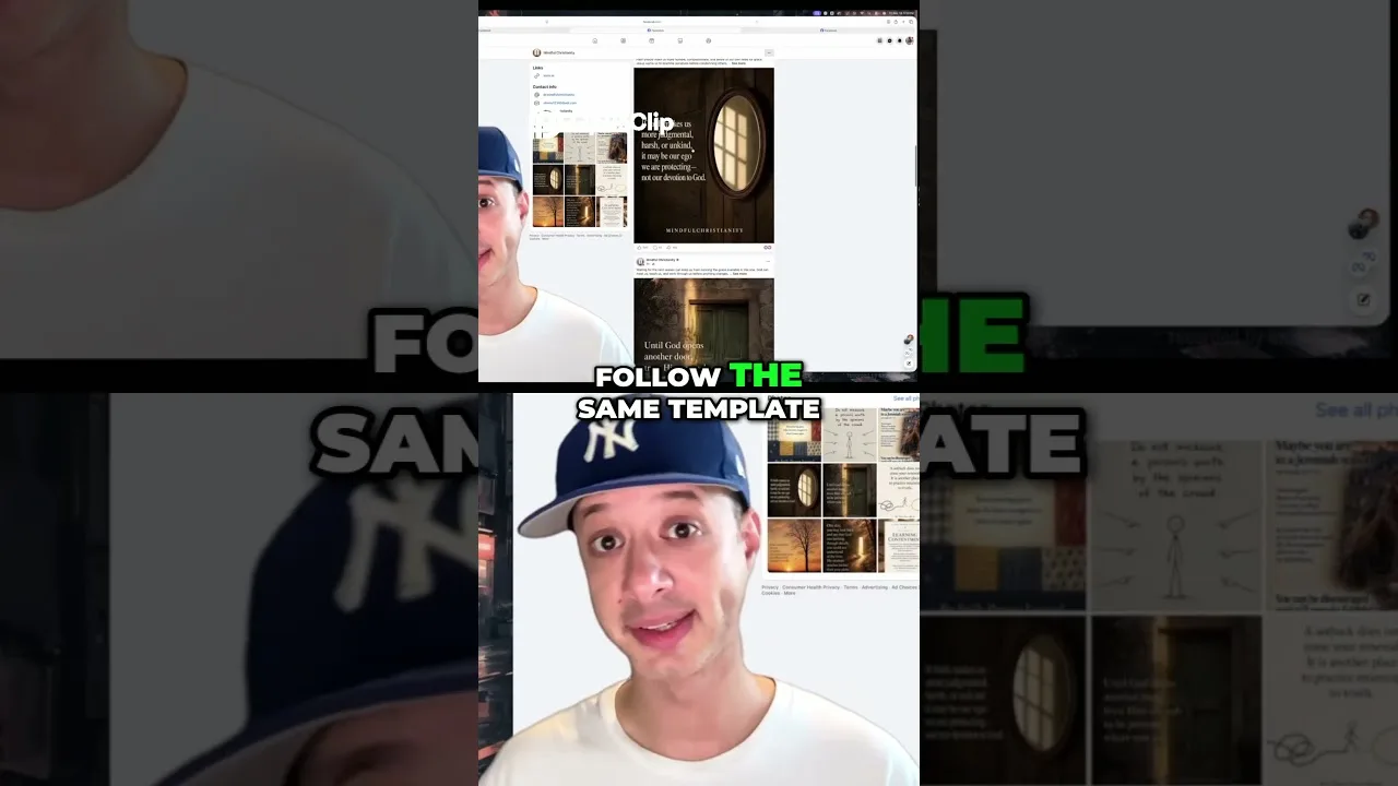
If you publish regularly, settle on one or two treatments and reuse them until they become recognisably yours. Save the reference images and prompt formulas that produce them; a house style is a small asset that compounds with every post.
Consistency beats novelty in feeds and listings because recognition is cumulative. Your audience learns your visual accent the way they learn a voice, and every consistent picture makes the next one cheaper to trust.
Style is a decision, not a decoration: name the job, pick the family, test on something boring, then commit. Pictures made that way look intentional, and intentional pictures are the ones people keep.
Save your winning style references with your prompt notebook. Together they are your studio, in two files.
When you teach someone else the app, teach style second — right after subject — and before any advanced trick. A learner who can name the medium they want has acquired the single most transferable judgement in image generation, and everything else you show them afterwards will land on prepared ground.
A style library of your own is the natural endpoint: the four or five treatments you actually use, each with its reference file and a one-line note about what it suits. Build it deliberately over a season and the question that opened this page — which style? — stops being a decision and becomes a reflex.